A Pomelo clinician might answer a question about infant feeding, update a patient’s chart, and then triage an episode of lower back pain–all before lunch, all for different patients. Every new task requires a context switch: who is this patient, and what are they here for?
To get oriented, a clinician opens the patient's chart and sifts through visit notes, screener results, appointments, medications, and potentially hundreds of messages. That time adds up quickly over a day’s work.
Chart review can also compete with attention that’s better spent on a patient. With limited time, small but important details of a patient’s situation could stay buried. Nobody is going to remember that a patient mentioned living alone a month and two hundred messages ago unless it's written down and surfaced.
LLMs excel at synthesizing large amounts of text, so our engineering team set out to build an AI-powered patient summary feature: a faster way into the chart to support our care team.
Designing the patient summary
The feature synthesizes what we know about a patient so that anyone opening the chart can catch up quickly. Clinicians need a concise summary relevant to the task at hand, while our system needs a comprehensive summary. We generate a separate summary for each purpose.
The comprehensive summary is a structured internal document intended to densely compress everything we know about a patient: message history, medical history, visit notes, medications, and appointments. Clinicians never see this document. We maintain it in the background as the foundation for other features.
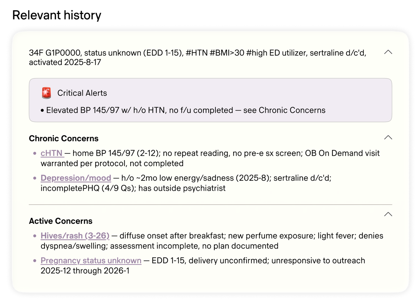
The relevant summary combines the comprehensive summary with recent patient messages and activity. It produces roughly 10 bullet points focused on issues from the last two weeks and chronic concerns.
Clinicians need to consume the summary at a glance, so we use clinical shorthand and group information into clear sections, including a dedicated Critical Alerts section. Here is an example using synthetic patient data. No real patient is depicted:
Keeping summaries fresh
A patient summary starts going stale as new information arrives. Regenerating it from scratch each time would add cost and latency. Some patients' message histories alone filled more than 100,000 tokens of context.
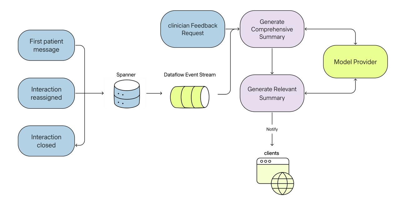
We maintain the summaries incrementally through events. The process uses a Pomelo data model called an Interaction, which represents a single messaging session between a patient and our clinicians.
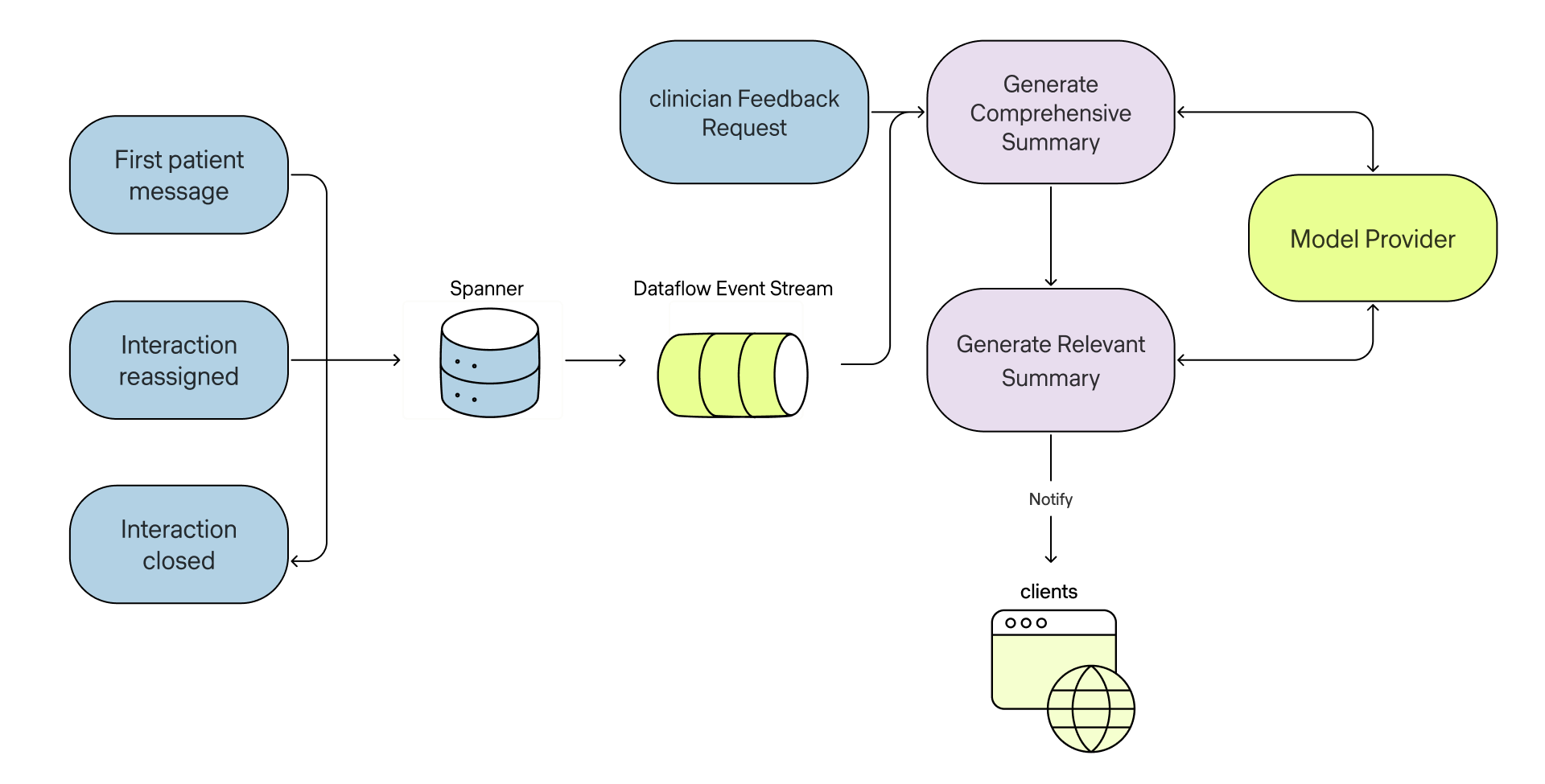
When an interaction starts, is reassigned to a different clinician, or ends, we regenerate the patient summaries. We give an LLM the existing summaries and any new patient information, then ask it to produce the next version. Patient data is not used to train their models. Our in-house event stream processes Spanner change streams through Pub/Sub in a Dataflow pipeline. The summary generation endpoints subscribe to interaction lifecycle events.
We also gave clinicians a way to manually trigger a summary regeneration with attached feedback.
Clinicians in the loop
We developed this feature by working closely with a beta group of clinicians. Every day, we received a steady stream of high-quality feedback–from suggestions on topic grouping and formatting to what constitutes a critical alert for a patient.
In addition to ad-hoc feedback, we conducted a series of structured reviews. We sampled patient summaries and expert clinicians graded the outputs along several axes, from clinical accuracy to style and information density.
All of this feedback was crucial, as there really is no substitute for expert human feedback when judging LLM outputs. It lets us rapidly improve the summaries and roll out across our practice with confidence.
We build the summaries to be checkable. Every line traces back to the note or message it came from, the full chart is always a click away, and nothing in the workflow assumes a clinician will take a summary at face value.
Impact
The feature was well received. The summaries help clinicians get oriented throughout the day, from routine messages to triage. Clinicians celebrated the feature as a “game changer” and told us they expected it to make providers happier and their days easier. Anecdotal reports came in about the Critical Alerts section surfacing information, such as allergies, that might otherwise have taken longer to find.
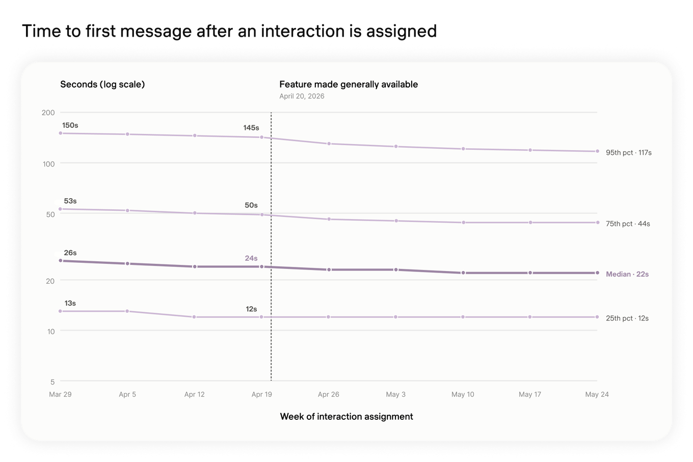
Our metrics also showed a modest reduction in the time it took clinicians to send the first message in an interaction:
We also watched an internal metric that evaluates six dimensions of patient-care interaction quality (safety, effectiveness, efficiency, timeliness, patient-centeredness, and equity). We noticed a small increase after the rollout:
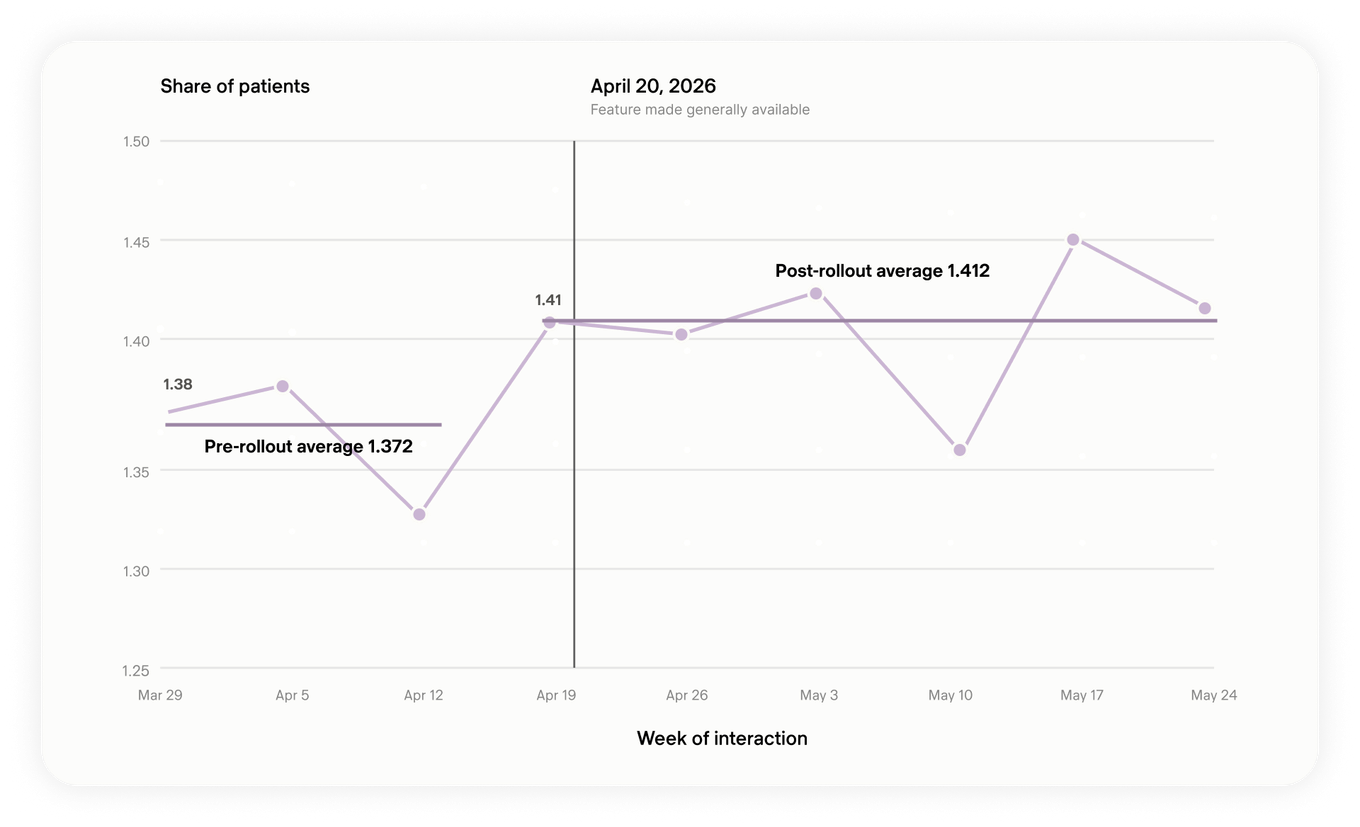
Trimming Tokens
Though launch went well from an effectiveness standpoint, costs were rising quickly. Patient summaries were burning through tokens, and the bill was getting larger.
Digging into the traces, we found that the context sizes for patients weren’t uniform. Most patients had reasonable message histories, but a long tail of patients messaged us far more often. The top 1% consumed over 40,000 tokens on messages alone.
You can see this illustrated in the chart below (note the logarithmic x-axis scale):
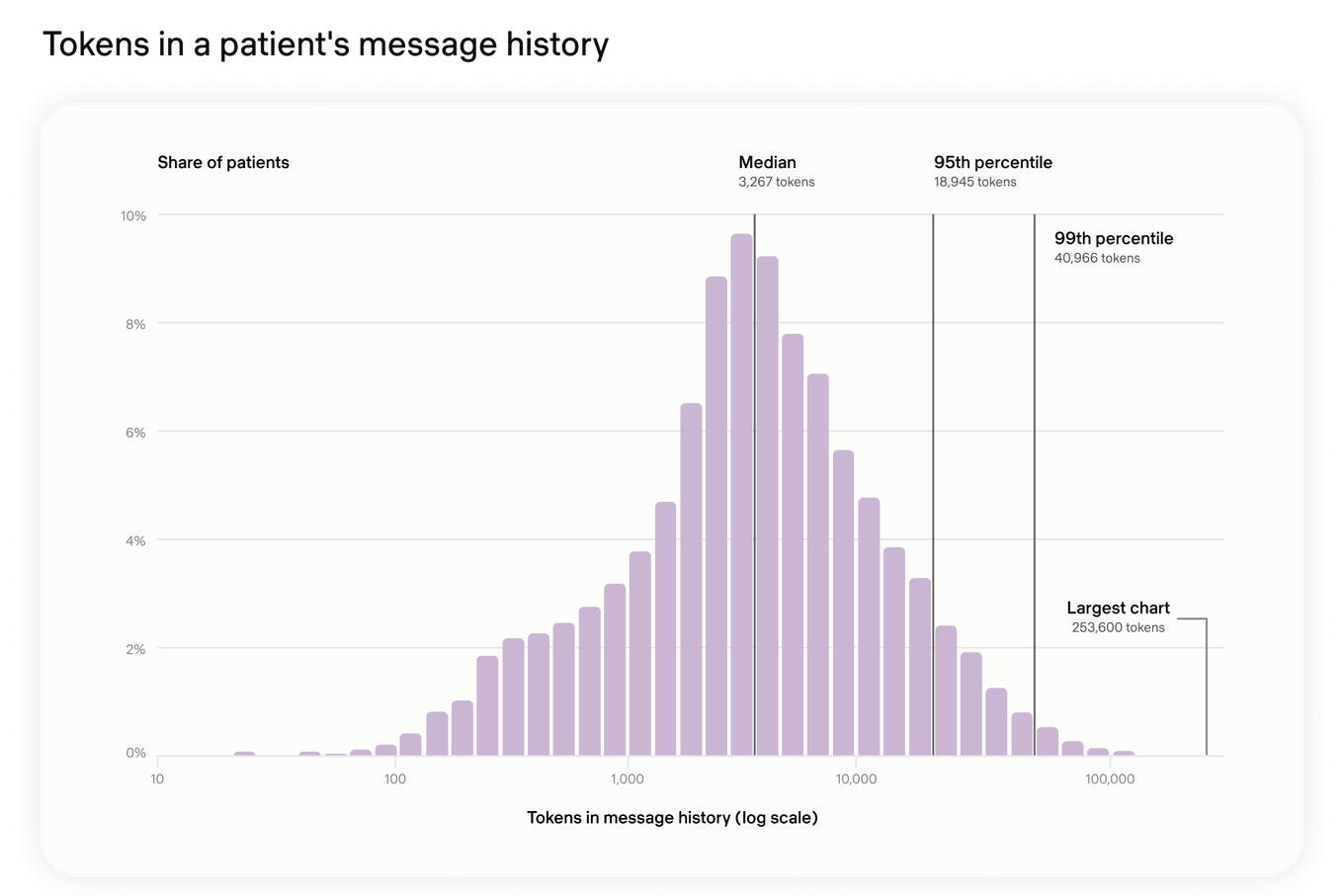
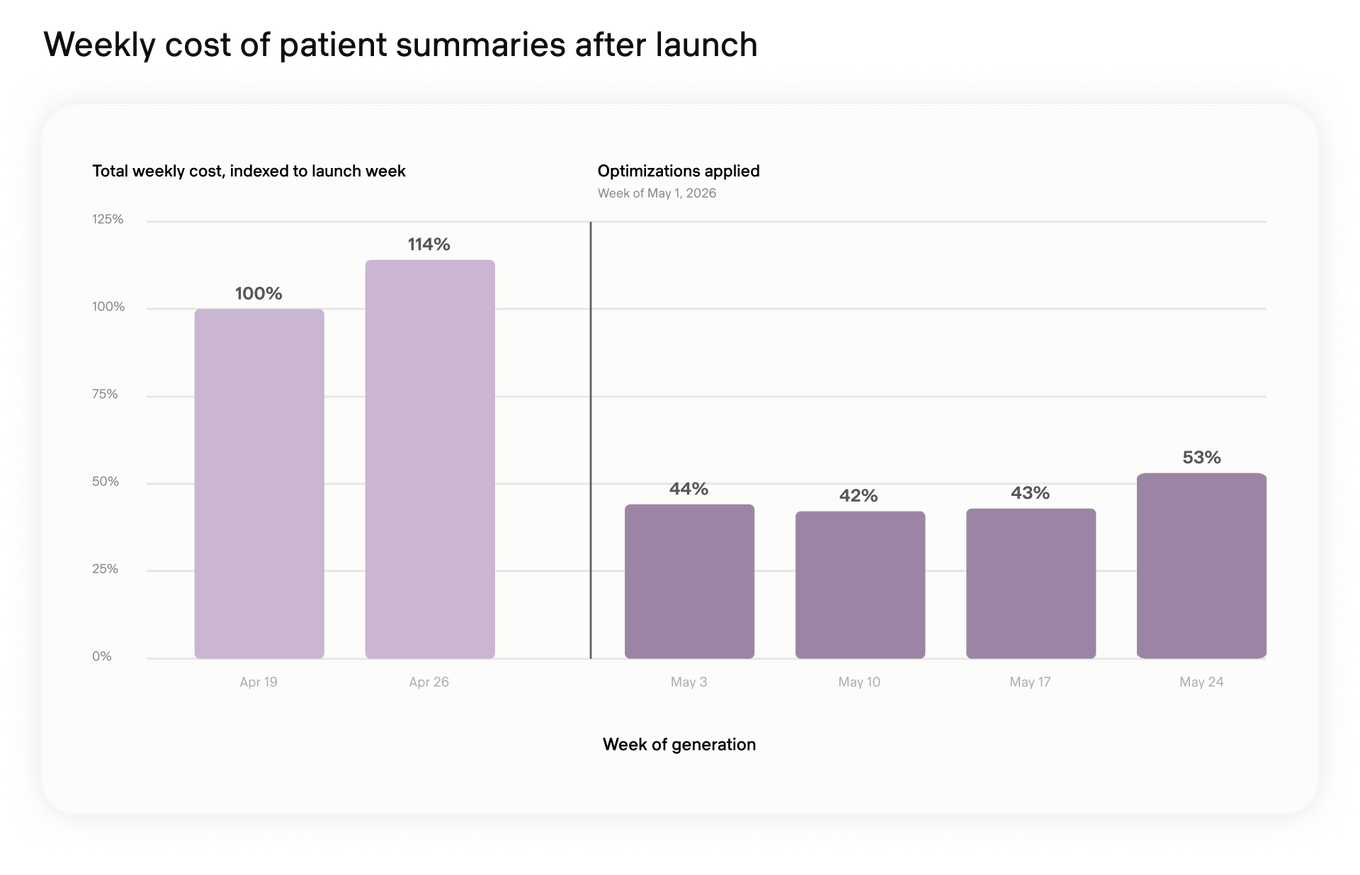
To fix this issue, we truncated parts of the message history and used individual interaction summaries as a smaller context replacement.
We also found that our system triggered more regenerations than necessary, due to interactions being reassigned multiple times (plus a few bugs). Hard caps on regenerations per interaction did the trick here.
Lastly, we removed a few model tools that were token-hungry but unnecessary for a summarization task.
Together, these optimizations allowed us to cut costs by over 50%:
How we build at Pomelo Care
Patient summaries required LLM evaluation with clinical experts and an event-driven system that keeps them current. For patients, it means the next clinician can find details faster, even when they sit hundreds of messages back.
Engineers worked directly with clinicians to shape the feature, then followed it into production to solve the cost problems that appeared at scale. That ownership and collaboration is central to engineering at Pomelo Care. We stay close to the clinicians using our software and own how it performs after launch.
Interested in solving problems like this? We’re hiring.
All stories